What Is a Bar Graph?
Taught in US schools

Key Takeaways
- A bar graph uses rectangular bars of different lengths to compare quantities across categories.
- Bar graphs can be vertical (column graphs) or horizontal, and always include a title, axis labels, and a scale.
- Reading a bar graph means identifying the tallest or shortest bar; creating one requires organizing data and choosing an appropriate scale.
What Is a Bar Graph?
A bar graph is a type of data display that uses rectangular bars to compare quantities across different categories. The length (or height) of each bar represents the value for that category - the longer the bar, the greater the value.
Bar graphs are one of the most common ways to organize and present data in elementary school mathematics and are introduced as early as 1st grade.
Parts of a Bar Graph
Every bar graph has several important components:
Title: Tells what the graph is about
X-axis: The horizontal line at the bottom
Y-axis: The vertical line on the left side
Scale: The numbered intervals on one axis
Labels: Names of the categories being compared
Bars: The rectangles that show each value
Vertical vs. Horizontal Bar Graphs
Bar graphs come in two orientations:
-
Vertical bar graph (also called a column graph): bars run up and down; categories appear on the x-axis and values on the y-axis.
-
Horizontal bar graph: bars run left to right; categories appear on the y-axis and values on the x-axis.
Both display the same information. Horizontal graphs work well when category names are long or when there are many categories.
How to Read a Bar Graph
To read a bar graph:
- Read the title to understand what is being measured.
- Look at the labels on each axis to know what the categories and units are.
- Check the scale to understand what each interval represents.
- Find the top (or end) of each bar and trace across to the scale to read its value.
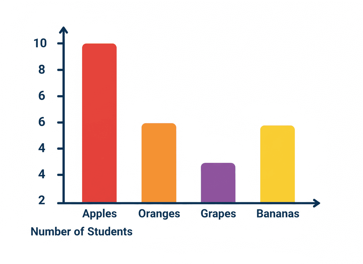
Example: A bar graph shows students' favorite fruits. The "apple" bar reaches up to 8 on the y-axis, so 8 students chose apple as their favorite.
How to Create a Bar Graph
- Collect and organize data (often using a tally chart first).
- Choose a consistent scale (count by 1s, 2s, 5s, or 10s depending on your largest value).
- Draw and label the axes.
- Draw a bar for each category to the correct height or length.
- Add a title and double-check all labels.
Connection to Other Data Displays
Bar graphs are closely related to other data representations:
-
Pictographs use symbols instead of bars and are often introduced before bar graphs in K–1.
-
Line plots show individual data points on a number line and are common in 2nd–4th grade.
-
Line graphs show change over time and appear in 4th–5th grade.
Understanding a bar graph prepares students to interpret all of these more complex displays.
Common Mistakes to Avoid
-
Unequal intervals on the scale - each step on the scale must represent the same amount.
-
Bars of different widths - all bars should be the same width; only height/length changes.
-
Missing title or labels - a graph without labels cannot be interpreted accurately.
Practice Activities
- Give students a bag of colored cubes and have them sort by color, then graph the results on a blank bar graph template.
- Show a completed bar graph and ask students to write three statements comparing the data (e.g., "More students chose red than blue").
- Have students survey classmates about a favorite (food, sport, animal) and create their own bar graph from scratch.
- Provide a data table and ask students to choose a scale, then draw and title the graph.
- Use a bar graph from a newspaper or website and discuss what real-world question it answers.
Frequently Asked Questions
What is the difference between a vertical and horizontal bar graph?
A vertical bar graph (also called a column graph) has bars that go up and down, with categories on the x-axis. A horizontal bar graph has bars that go left to right, with categories on the y-axis. Both show the same information - the orientation depends on the data and how much space you have.
What is the scale on a bar graph?
The scale is the set of numbers shown on one axis (usually the y-axis for vertical graphs) that tells you the value of each bar. A scale might go by 1s, 2s, 5s, or 10s depending on the size of the data. Choosing a consistent scale is important so the graph is accurate and easy to read.
How is a bar graph different from a pictograph?
A pictograph uses pictures or symbols to represent data, while a bar graph uses solid rectangular bars. Bar graphs are generally more precise because they use a numerical scale, whereas pictographs use a key (e.g., each symbol = 2 votes) that can introduce rounding.
Free Bar Graph Worksheets
Curriculum-aligned printable worksheets for Kindergarten – 5th Grade. Download free.


