Plant Growth Study With Scatter Plots
Written by Adi Ackerman, Head Teacher
"Plant Growth Study With Scatter Plots" is written for 8th Grade (Ages 13-14), and it covers Common Core 8.SP.A.3. A 7th grader who is already steady on data & graphing can use it too, and an older student can use it as a short review.
2 pages in this set
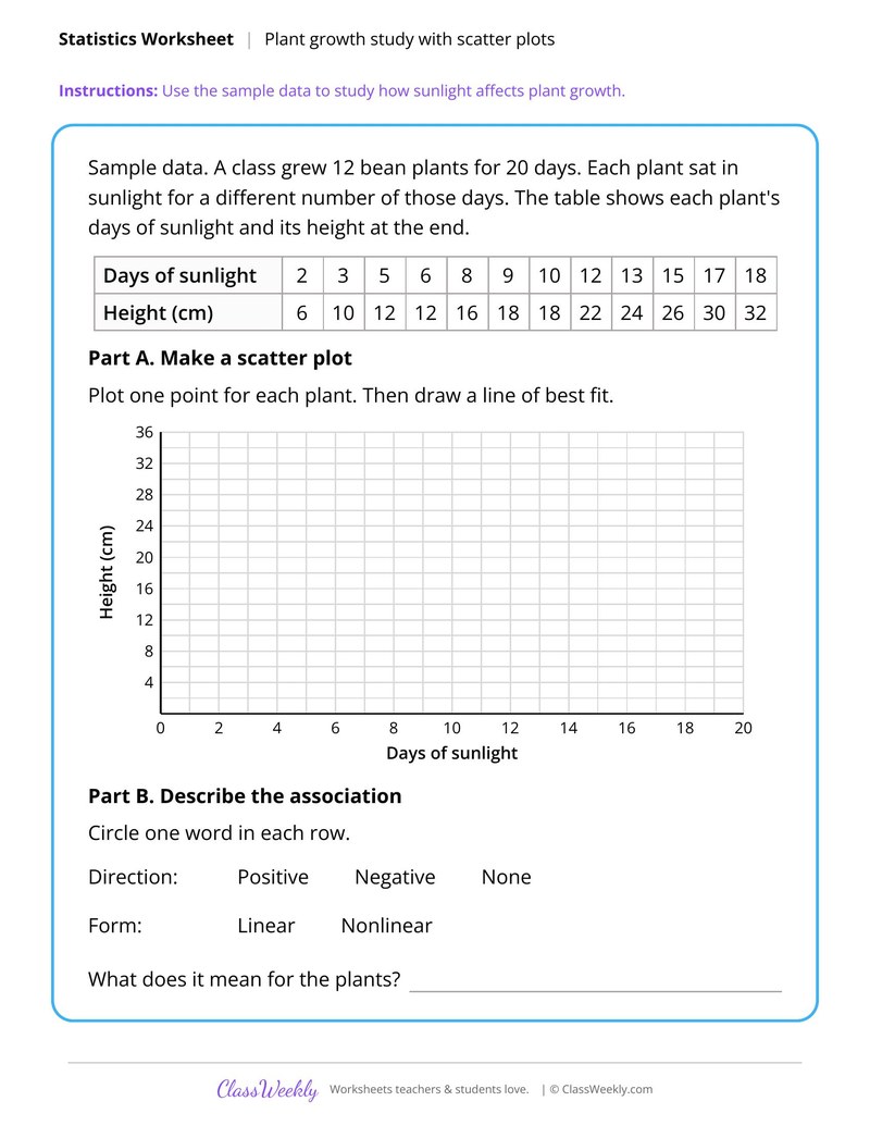
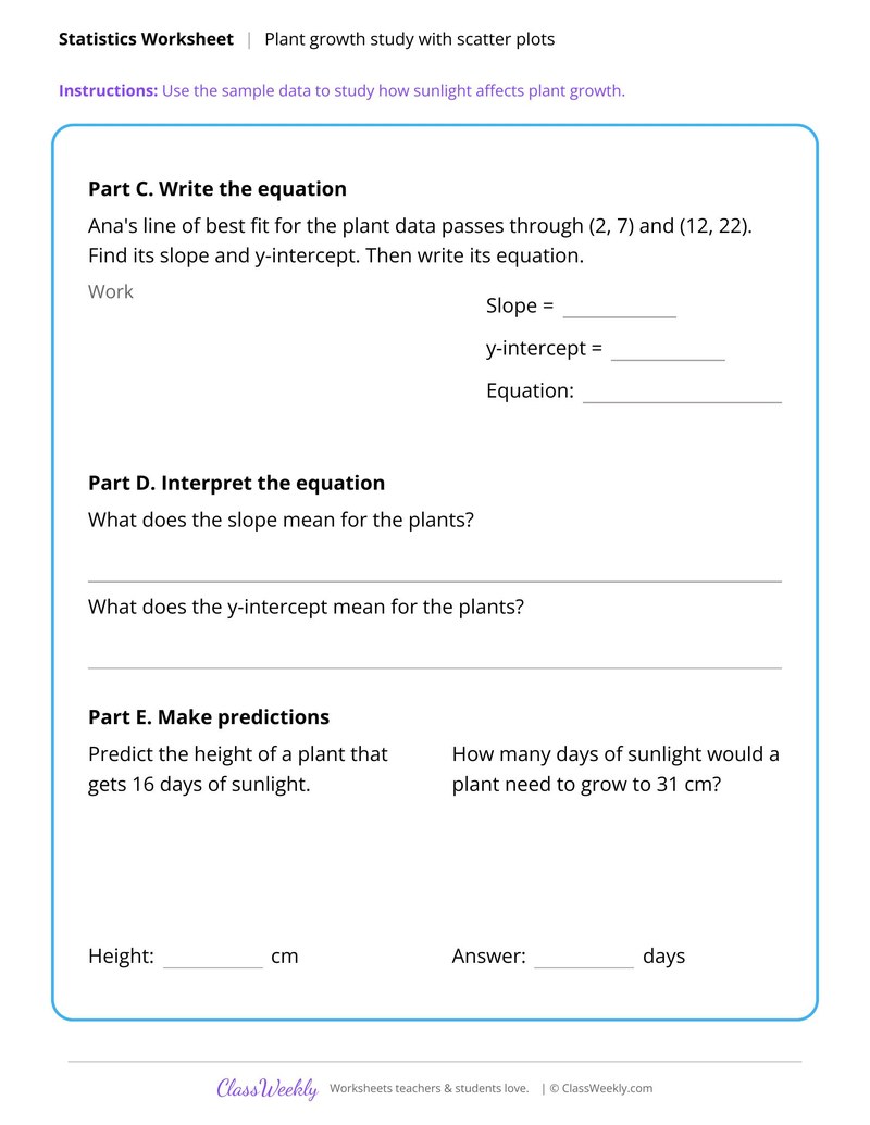
8th grade math worksheet: plot sample data for 12 bean plants, fit a line, write its equation and predict growth at 16 days. Answer key included. Part of our scatter plots and lines of best fit data & graphing collection. Aligned to Common Core standards.
How do I use this worksheet?
Use the describe and construct sheets first, then the line of best fit sheet. Save the plant growth study as a closing task or a small group project.
What students will practice
- Students will plot days of sunlight against plant height and draw a line of best fit.
- Students will write the line's equation from two points and interpret its slope.
- Students will use the equation to predict a height and the days needed for 31 cm.
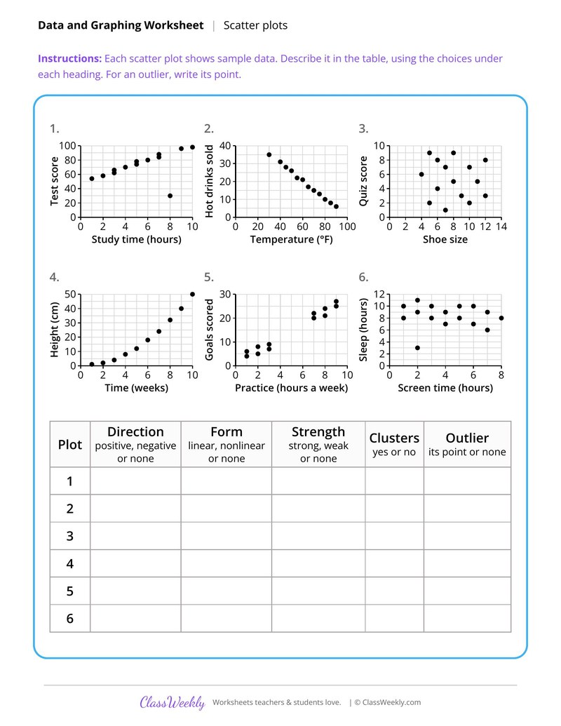
Describe Association in Scatter Plots
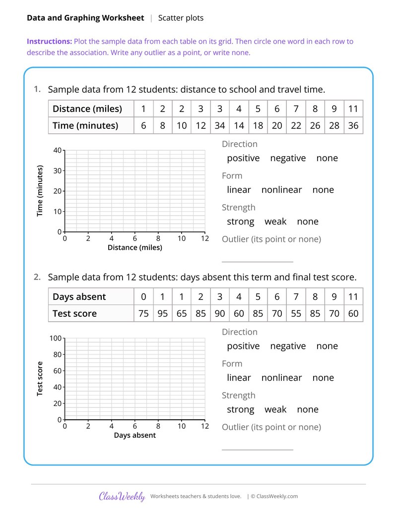
Construct Scatter Plots From Data Tables
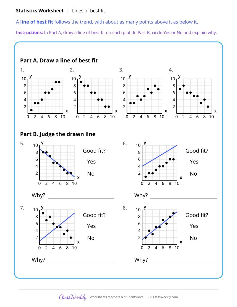
Draw and Judge Lines of Best Fit
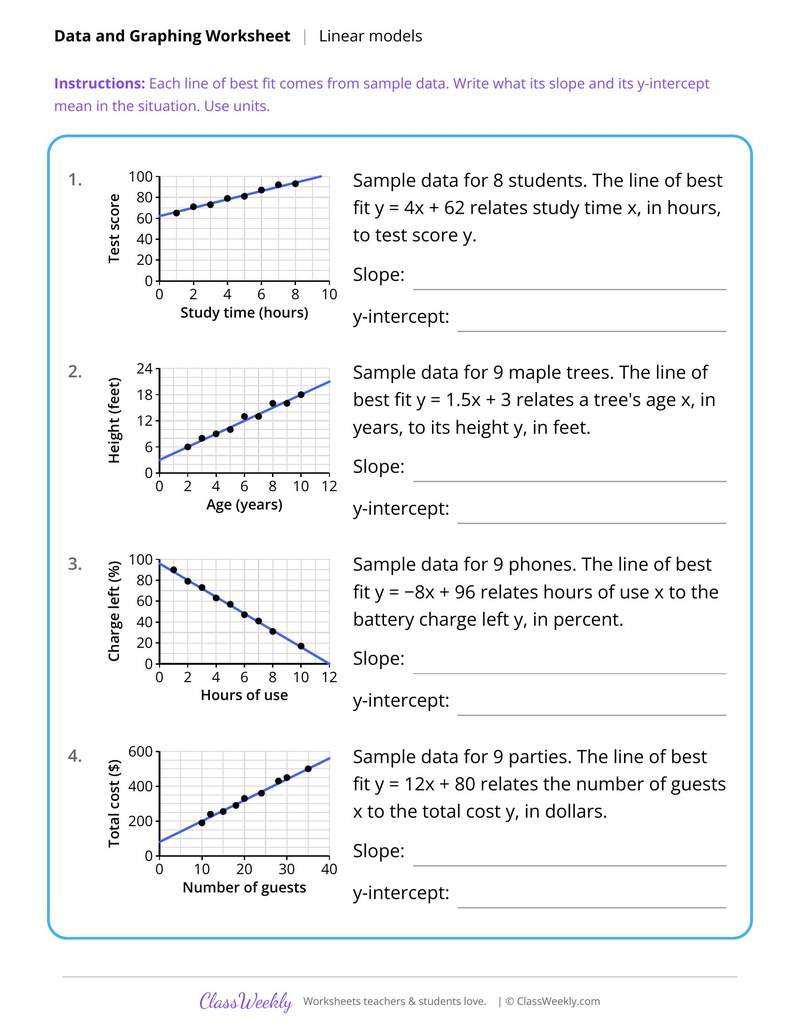
Interpret Slope and Intercept of a Line of Best Fit
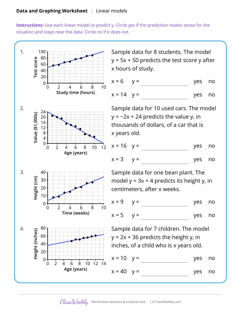
Use a Linear Model to Make Predictions
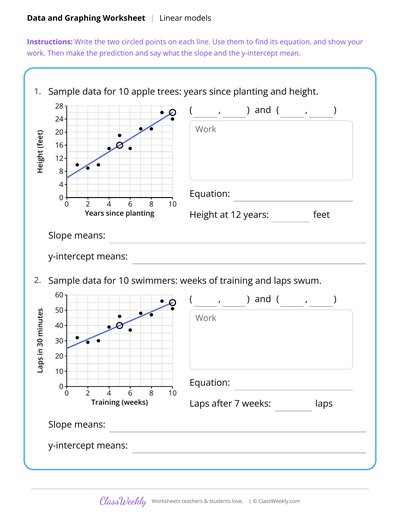
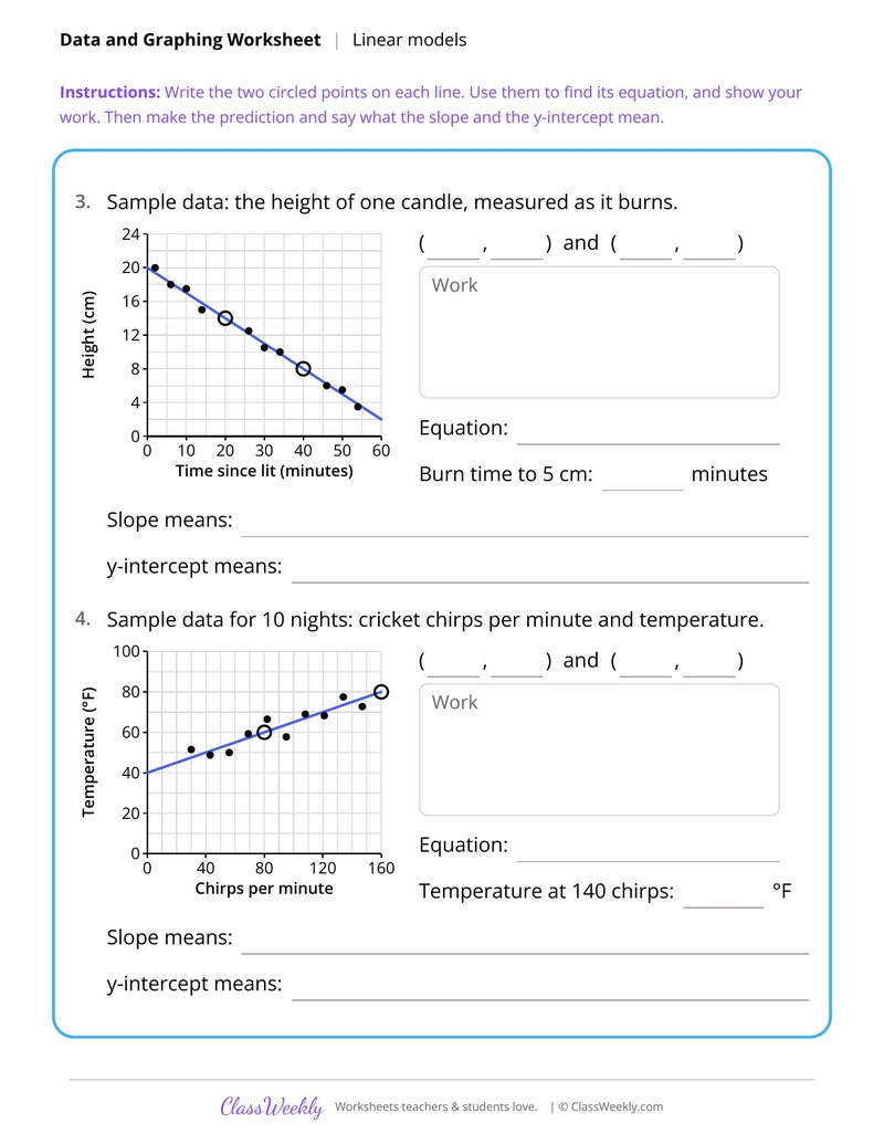
Write a Linear Model From a Scatter Plot
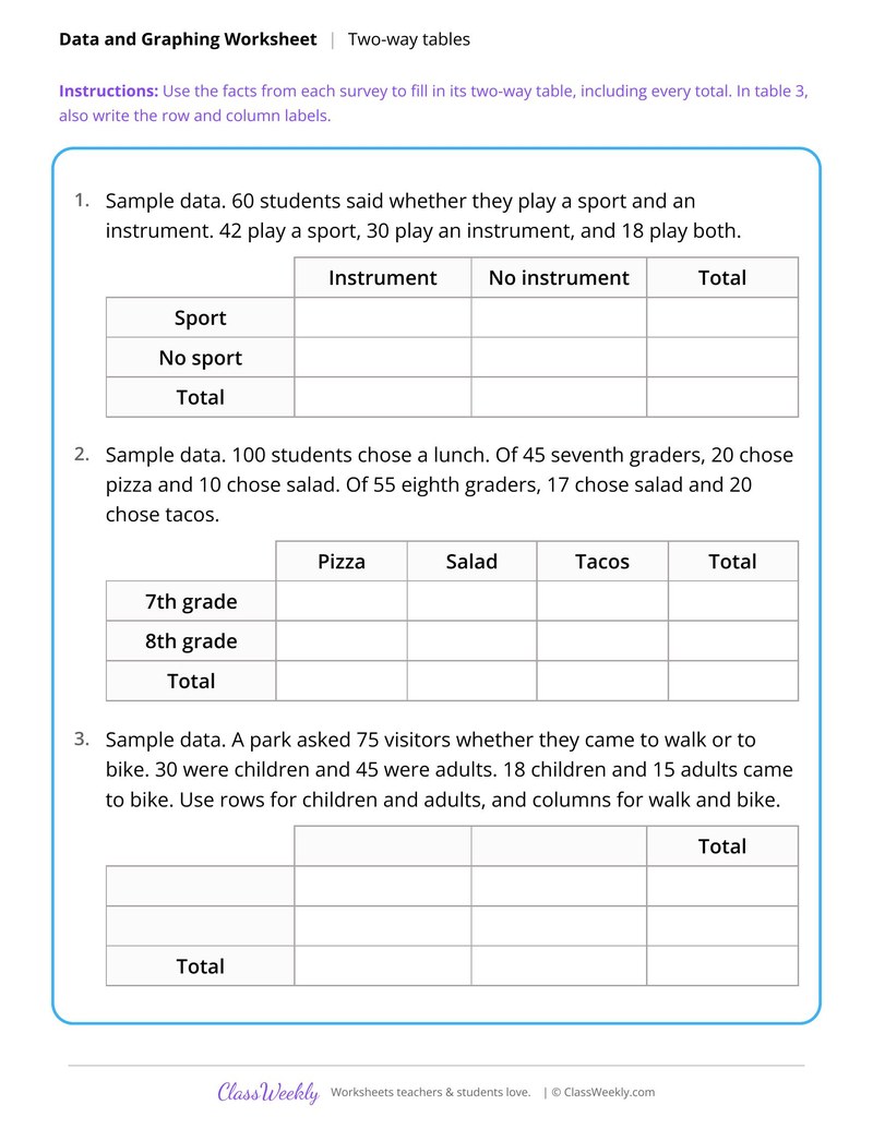
Build Two-Way Frequency Tables From Surveys
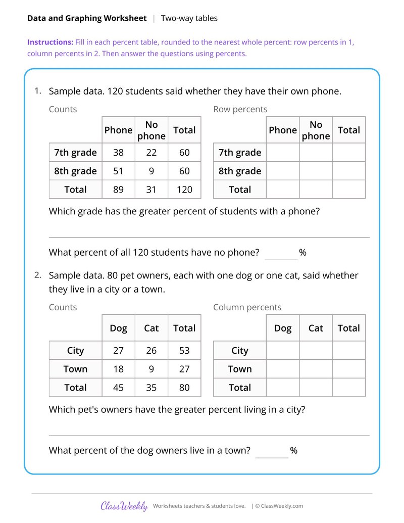
Two-Way Relative Frequency Tables by Row and Column
Curriculum Links
Common Core State Standards
Statistics and Probability · 8th Grade
Standard: Use the equation of a linear model to solve problems in the context of bivariate measurement data, interpreting the slope and intercept.
View all 8.SP.A.3 worksheets →Find this in the curriculum
Browse the grade, subject, and topic this belongs to.
FAQ
How do I use this scatter plots and lines of best fit worksheet?
⌄
Use the describe and construct sheets first, then the line of best fit sheet. Save the plant growth study as a closing task or a small group project.
What does this worksheet teach?
⌄
Plot sample data for 12 bean plants, fit a line, write its equation and predict growth at 16 days. The directions on the page read: Use the sample data to study how sunlight affects plant growth. An answer key is included.
Can I use this scatter plots and lines of best fit worksheet for homeschool or classroom?
⌄
Yes, both. We made it for 8th grade data & graphing, and it works the same at home or at school. At home, a student can work through it alone and then go over it with you, which shows quickly what is solid and what needs another look. In class it works as independent practice, homework or a warm-up, and you can print one copy or a full set.
How do you describe the association in a scatter plot?
⌄
Give its direction (positive, negative or none), its form (linear or nonlinear) and its strength (strong or weak). Then name any outlier by its point. Describe Association in Scatter Plots uses a table for these choices.
What is an outlier on a scatter plot?
⌄
It is a point that sits far from the pattern of the others. In Construct Scatter Plots From Data Tables, one student's 3 mile trip takes 34 minutes, far above the rest.
What makes a good line of best fit?
⌄
It follows the direction of the points, with about as many points above it as below it. Draw and Judge Lines of Best Fit has students explain why a drawn line does or does not fit.
Ratings & Reviews
No reviews yet. Be the first to share what you think.
Reviews are for ClassWeekly members.
Make a Request
Spotted something to fix, or want a worksheet we don't have yet? Tell us and we'll make it.
Worksheet Details
| Grade | 8th Grade |
| Subject | Math |
| Topic | Data & Graphing |
| Standard | 8.SP.A.3 |
| Pages | 2 pages |
| Difficulty | Medium |
Learn More
What is ClassWeekly?
ClassWeekly offers free worksheets and printable learning resources for kids, from preschool up. All worksheets are aligned to Common Core, NGSS, and C3 Framework standards and designed by educators. Become a member to access the full library and download unlimited PDFs.
Describe Association in Scatter Plots
Construct Scatter Plots From Data Tables
Draw and Judge Lines of Best Fit
Interpret Slope and Intercept of a Line of Best Fit
Use a Linear Model to Make Predictions
Write a Linear Model From a Scatter Plot
Build Two-Way Frequency Tables From Surveys
Two-Way Relative Frequency Tables by Row and Column